| |
|
|
|
back to NCPA main |
 |
About designing the NCPA |
|
My model of the NCPA was designed as an entry for a design competition held for the 2009 Beijing ICOGRADA design conference. The goal of that competition was to design creative possible merchandise for the NCPA, and I figured it a perfect chance to combine my hobby and my professional work.
But there was a tiny problem: I was asked to join the competition less than one week before the deadline, leaving too little time, so the design work ended in a number of night shifts. It was probably the first time I worked on a papercraft day and night. It was done in four days.
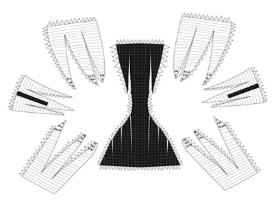
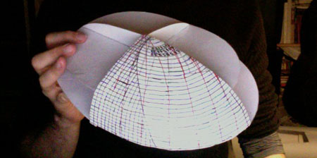
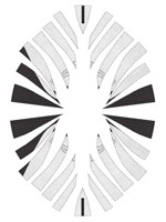
I built the first prototype based on formers derived from the actual shape and proportions. I created a paper dome, and then cut the parts from it, resulting in the first beta. I started to do a second prototype, where I wanted to cut the parts first, but that didn't work well.
The first beta built quite well, and created a nice dome shape, but it had some problems. Firstly, the parts didn't look quite nice on the page, which is something I had intended for this model, and secondly, the structures didn't fit properly, worst were the windows at the dome's peak and it was only symmetric as two halves.

|
 |
|
 |
 |
|
|
| The version of above built |
|
|
| |
|
|
|
I was almost ready to give up, because time was running out, but decided to give it at least one more try. This led to the third prototype on which I already drew all relevant structure. While the first prototype featured a half dome, I chose to build only a quarter dome this time, to achieve better symmetry.

|
|
|
The beta of the new version worked good enough, so I went on to the colouring. This was an annoying work, because I had to colour each line of the structure separately. When the coloured version was finished, I decided to drop the formers, because they weren't really necessary for that size, and ... they didn't fit. Also they would have required to add two pages that are almost white only.
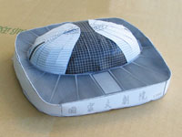
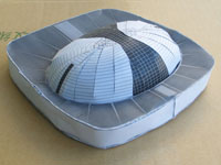
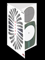
For the competition, I suggested this design to come in three versions: The actual model, which features a pedestal and is on a big page folded to three A4-pages, as well as a poster and a postcard with the main page of the model, featuring the dome only.
The design was listed as one of the 20 winning designs, but hasn't been chosen for production.
For the release on my website, I added english translations and created instructions.

|
 |
|
 |
 |
|
|
| The original black & white version of the second beta |
|
The model as proposed for the competition |
| |
|
|
|
| |
| return to top |
| |
|
|
|
